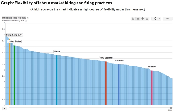
Friday Graph: NZ’s Relatively Inflexible Hiring and Firing Practices

The ‘creative destruction’ of competitive processes requires labour and other resources to be continually shifted from contracting areas of the economy to expanding areas.  Rigid labour markets impede this process, with government regulations being a common cause of inflexibility.

A March 2012 IMF Working paper here uses statistics on 97 countries between 1980 and 2008 to assess the importance of labour market flexibility.  It finds that financial crises initially have a large negative impact on unemployment, but this effect rapidly disappears in the medium term in countries with flexible labour markets.  There is less pronounced, but more persistent, unemployment in countries with more rigid labour market institutions.  No surprises there.

A second March 2012 IMF Working Paper here by the same authors, also using a panel of 97 countries but this time spanning the period from 1985 to 2008, suggests that improvements in labour market flexibility, particularly in respect of hiring and firing regulations and hiring costs, reduce unemployment, youth unemployment and long-term unemployment.

Given the importance of ease of hiring and firing for flexibility, it is regrettable that New Zealand ranks so poorly in the world (86th) in respect of such practices – according to the latest World Economic Forum’s Global Competitiveness Index 2011-2012 (see the graph below).

click above to view larger

More happily, New Zealand ranks much better for other aspects of labour market flexibility in this index, being 10th in the world overall.

Note that the ranking for hiring and firing is based on surveyed opinion rather than ‘hard’ data.

Readers can create their own charts here using this database.

Friday Graph: Public Sector ‘Austerity’?

Statistics New Zealand released its December quarter 2011 employment numbers last week and this week’s Friday Graph plots the public sector numbers on a calendar year average basis.

click the graph to enlarge

The blue columns show that total filled public sector jobs have risen every year since 2005.  The rise between 2011 and 2005 is 9.8 percent with no signs of any slowdown.

The red line shows that total filled public sector jobs have risen from 22.1 percent of total filled jobs in the private sector in 2005 to 24.1 percent in 2011.

Not shown in the graph is the drop in private sector total filled jobs from 1.404 million in 2005 to 1.359 million in 2011.  Private sector filled jobs in 2011 were only 0.5 percent up on 2005.

Not much evidence here of overall public sector cutbacks to date, or of a material rebalancing of the economy in favour of private enterprise and growth.

In interpreting these figures, bear in mind the following points:

  • Total filled jobs is not a good measure of numbers employed as some people have more than one job.
  • SNZ’s definition of public sector is very broad; it includes local government.  That is why the number of filled jobs is so large.
  • The State Services Commission has reported a small reduction in total full-time equivalent employees in (central) government departments ­– from 44,672 in June 2009 to 43,595 in June 2011.
  • SNZ has total filled jobs in public administration and safety dropping by 1,000 (rounded) between June 2009 and June 2011 (from 92,000 to 91,000).